Calsync scheduling
Designing a product that matches people's calendars to find meetup time. 8 mins read - detailed process included
MADE April 2019 - September 2019
AS Product Designer, solo 0-1 work
WITH Andrew Guterman
CHALLENGE
How might we help friends see each other more often?
You know the moment when people can't hangout because they all have their own schedule. Finding a hangout time that works for everyone is so hard that it sometimes stops people from seeing each other. We wanted to make more meetups happen. We wanted to create a product that makes scheduling easy so people can meetup and see each other more often.
Research
Users research
Through short interview, I understood that scheduling group meetup is not only hard to coordinate but also raises people's concerns over privacy when they share their availability. Creating a neutral scheduling app solves the privacy issue and also makes scheduling much more efficient. It's not hard to see why there are so many scheduling apps in the market. We wanted to then survey if the current apps in the market have solved all the scheduling problems and if there're chances for us to design a new product.
How people schedule meetups now
• Text (online messaging)
• Talk (offline meetings)
• Compare calendars
• Group videos
• Scheduling apps
Pain points
• Sharing calendars and availabilities give people privacy concerns
• Texting or talking doesn't intuitively communicate calendar availability
• Having to jump between multiple people is tedious
Our typical user...
Uses calendars
Most people have a online calendar product to manage their schedules
Likely is first time user
Most people do not or have not used a scheduling app
Need it 1-2 times/week
Users plan meetups 1-2 times /week; usually at work or school.
Market analysis
The scheduling apps market is filled with big companies like Doodle and Acquity. However since the majority of these products are made for scheduling business meetings; the demand for a good personal meetup scheduling tool still exists. We wanted to design a product that's specialized for personal scheduling that's more efficient and usable than the existing solutions

User journey map
I broke down the user journey for scheduling meetups into 7 stages and compared the experience when people use three different kinds of scheduling products. I discovered that users often need to go through a long setup process before they can start scheduling. Additionally, users have to jump between the scheduling app and their calendar. These unaddressed pain points can become our opportunities: having a faster setup and more streamlined scheduling experiences could be our product's advantage

MVP 1
Solution format + features
The need for an efficient, quick and intuitive way to schedule meetups led us to the idea of matching people's calendars to find meetup time. Thought sync calendar is a common feature in many scheduling products, none had built a product around calendar and fully embrace its advantage yet. We wanted to leverage the idea of visualizing calendar availability and create a streamlined experience for people to import calendar, compare availability, and add meetup time to their calendar.
After conceptualizing the product, I divided the main task flow into three stage.


MVP 1 Usability testing
In 2 weeks, we built a MVP and started usability testing. After testing with 5 college students, I found out that although the calendar sync feature is loved, the interaction lacked instructions. Originally I listed all the features on the main screen intentionally to give users freedom, but that backfired and made users lose clue on where to start. In the next iteration, I planned to solve the instruction issue and further optimize the interface.


usability testing report
Key problems to solve
• User don't know where to start on the interface
• User lose attention over the calendar sync process
• User is confused by the person identification system.
• User is not aware of some features.
MVP 2

Welcome
When onboard the page, users can fill meetup detail or skip and go straight to inviting people. Users will not need to sign in to view the meetup, but yes if they want to join the meetup

Edit availability
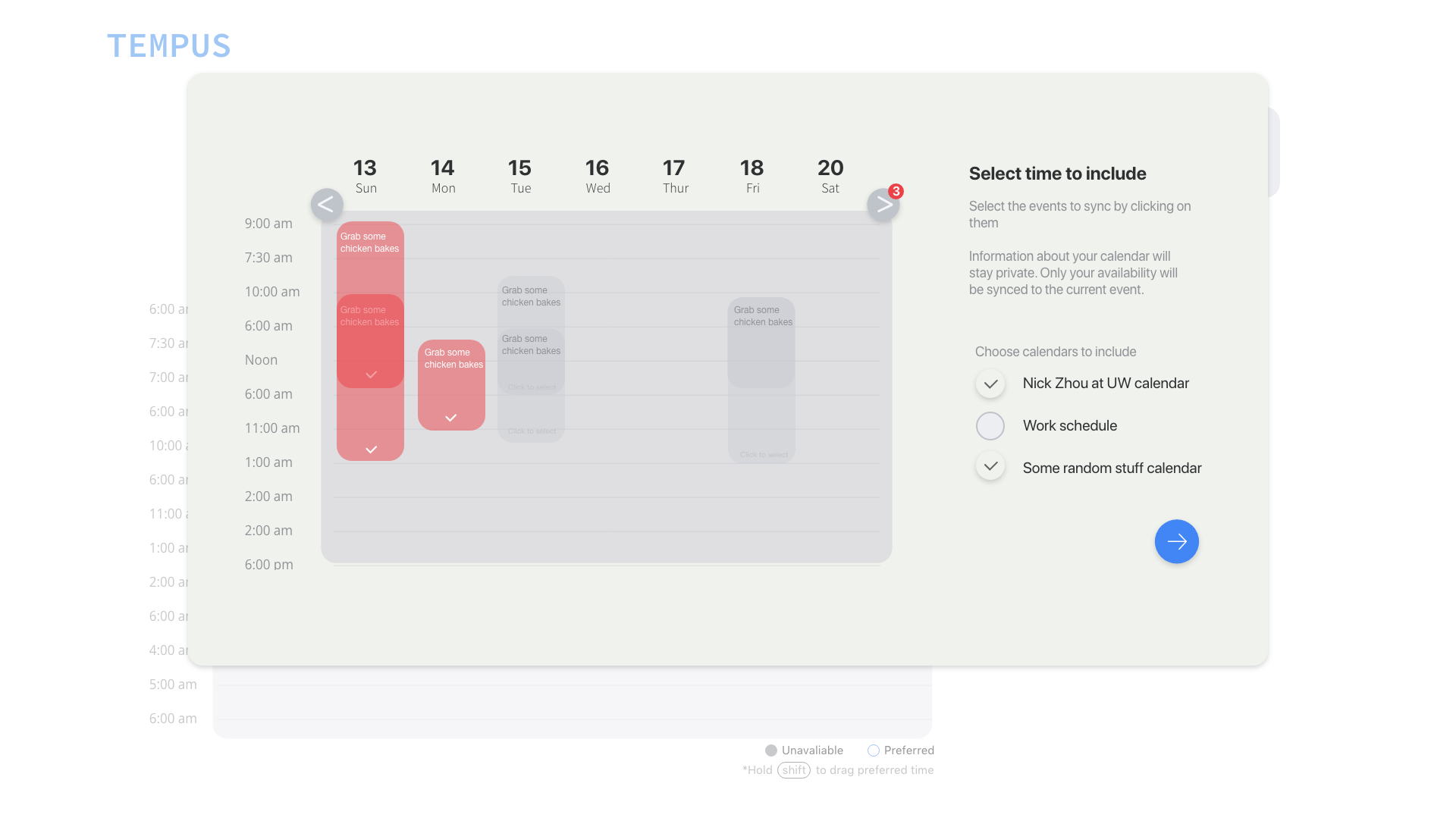
In this version, users can sync their calendars in one click. The import setting task flow is replaced with a calendar control panel that users can use to decide which calendars and events will be included

Share results
Users can toggle between the personal canvas that shows their own calendar events in blue or the group canvas that shows everyone's availability in grey boxes. When users find a time, they can simply drag to tell their friends.
Friend-centric branding
The product also has a new branding that puts friends at the center. Users will see their friend's portrait and names appear at various touch points such as joining meetup and sending messages. They will also read more conversation like UX writing throughout the product and create those messages themselves. By including the social elements as part of the emotional design, I hope to make users feel excited for the their meetup in their experience.
.png)
Privacy safe
To address user's privacy concern, I separated view rights into two modes. Users can see their calendar event time and details on their own calendar, but only time on their peers'. The authorization to each person's event is also done by device so that no one can access and read other people's calendar.
hover over to see the differences in two modes
Future direction
As I continue to iterate on Calsync, I planned to implement more features like saving a canvas for next time and viewing past meetups to help speedup user's workflow. To achieve these goals, I plan to introduce an account system that allows third party sign in. At the same time, I wanted to introduce the concept of host badges along with the accounts to help users measure how many meetups they have scheduled and who they have been in a same meetup in, which will be a good opportunity for emotional design. In all, Calsync will keep evolving and bringing more people together one meetup at a time.
MVP 3
With MVP 3, I have settled on product framework and began focusing on further enhancing the experience. In the new interface, the mode banner is replaced with a small, color-coded mode indicator, the participants section is merged with the utility section and shrunk. The new version gives more attention to the canvas and has a simplified interaction flow.


Reflections
Looking back, here's what I've learned.
Designers need to learn to balance
Experiences need to be balanced: balancing between freedom and instructions, first time and returning users, and fast and reusable. There's a subtle line between featurism and streamlined experiences. We should craft every experiences carefully considering each project and user's uniqueness
Refine till the design solves problem
I went through a big redesign after receiving insights from the last MVP testing. The new product is much simpler and usable than the originally made. It proves that having an idea is just the beginning, refining the design till it solves the problem is the real game.
